Few cultural moments have shaped modern design trends the way Stranger Things has. With the end of the Series, it cemented a brand aesthetic that has influenced creatives, marketers, typographers, and designers for nearly a decade. From the first eerie notes of its synthesizer score to the flickering red logo, the show’s visual identity is a masterclass in nostalgia branding and retro design. Its creators and creative partners built a distinctive look that feels immediately familiar yet fresh — a bold homage to 1980s typography, color, and style. Over five seasons, Stranger Things built a visual identity that evolved just like its characters: consistent, emotional, and always charged with atmosphere.
In this blog, Zaapr breaks down how Stranger Things became a design phenomenon: from typography and logo construction to world-building aesthetics, color theory, motion design, marketing strategies, and brand collaborations.
Photo Credit: Jacob Boghosian
The Iconic Logo: A Masterclass in Timeless Typography
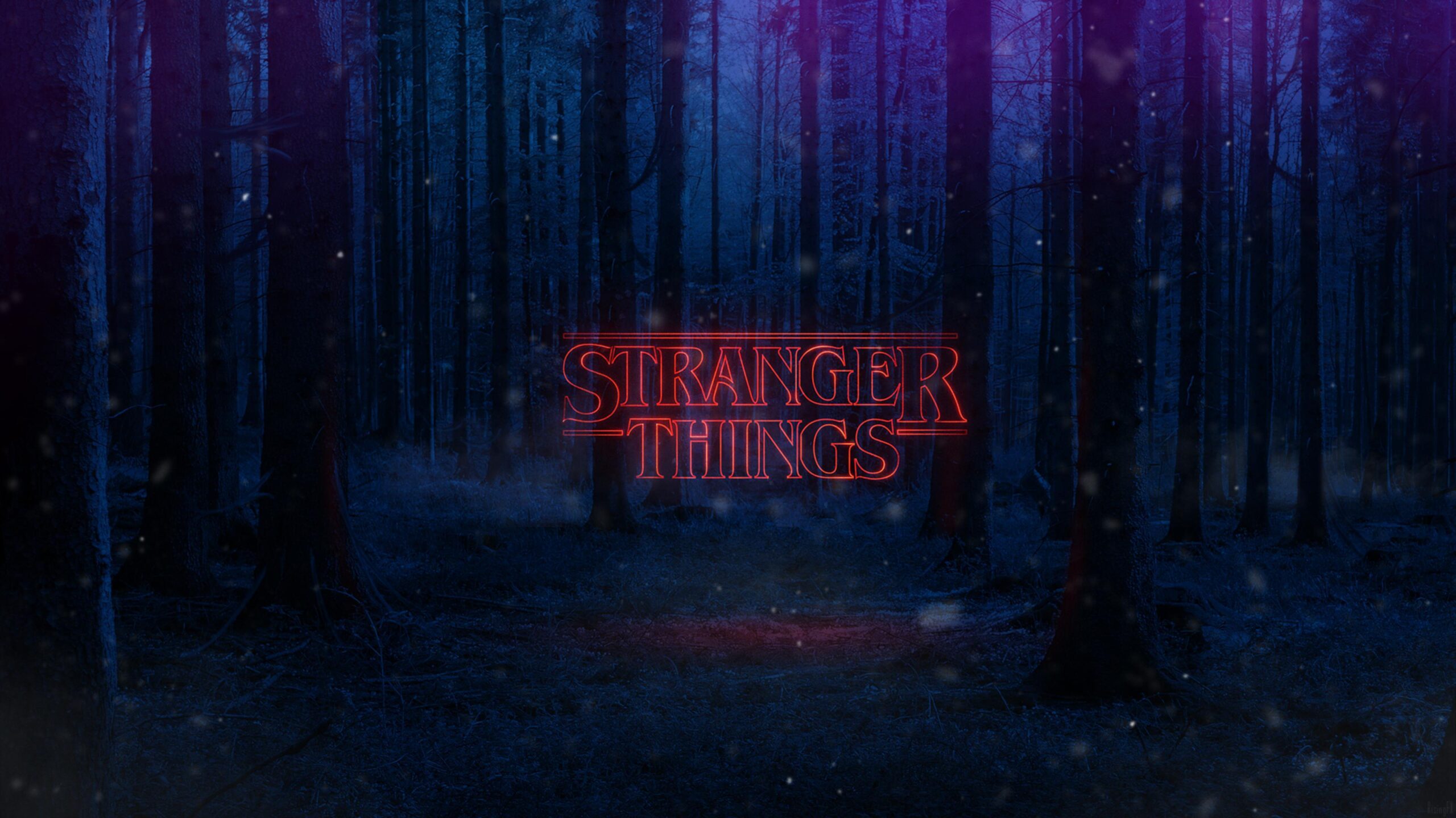
The Stranger Things logo is arguably one of the most recognisable pieces of pop-culture design from the 2010s onward. The Duffer Brothers insisted on a serif wordmark that felt 1980s rather than modern, sleek sans-serifs. They landed on ITC Benguiat, a serif typeface popular in 1970s-80s novels, the logo instantly teleports audiences to an era long gone. Contend’s Jacob Boghosian extended the “S” and “R” below the line (a trick borrowed from Stephan King’s Different Seasons cover, and then Imaginary Forces animated it in blazing red. These large drop-caps and sharp serifs became Stranger Things’s fingerprints: they hint at pulpy horror (like Goosebumps) and adventure (like Goonies), and hook the eye with dramatic crossbars and close kerning.
Notably, every season after the first appended a giant numeral behind the letters: a subtle graphic device to tie each chapter together. Season 2 saw a glowing “2” envelope the text, Season 3 used a deep red-gradient “3,” and Season 4 faded the letters to grey around a bright red “4”. These iterative tweaks kept the logo fresh while preserving its core identity.
Zaapr’s Point of View: Typography that Carries the Story
At Zaapr, we see typography as more than a design choice. It’s a storytelling tool. Stranger Things is a rare example where type doesn’t sit on top of the narrative; it moves with it. Before the story begins, the typography already tells you what kind of world you’re entering.
- Anchored in the Analog Era
The serif wordmark places the show in a pre-digital time. It feels printed, tactile, and slightly imperfect. That quality connects naturally with the 1980s setting and avoids the trap of modern polish. - Intentional Imperfections
Tight kerning, stretched letterforms, and uneven spacing give the type a human presence. - Consistency with Evolution
Each season adds small changes while the core typography stays intact. That consistency is what builds long-term recognition. - Designed for both Still and Motion
The type holds its impact and carries the same weight across all formats without losing meaning. - Emotionally Coded over Time
Viewers don’t need context anymore. The association with mystery, tension, and unease has been given through repetition and restraint.
It proves how typography alone can become a brand universe when executed with clarity and consistency. As Logo Design Magazine puts it, “the combination of dramatic angles, negative space, and disproportionate lettering evokes feelings of mystery… The logo design itself is strange, which makes it ideal for a show that celebrates strangeness!”
Photo Credit: Screenshot from Netflix.
Color and Motion: Where Mood Takes Over
Stranger Things uses color and motion with intention. The palette consistently draws from classic ‘80s horror posters and sci-fi arcade art. Deep midnight blues and heavy blacks dominate the frame, while sharp neon reds cut through the darkness, conjuring Hawkin’s world while setting the moodboard for the show.
Early seasons relied on shadow and restraint, with red appearing like a warning signal. As the story progresses, that red grows stronger. By Season 5, it almost overwhelms the frame. Still, traces of cool blue remain, quietly anchoring the visuals to the show’s origins. This contrast is consistent across posters, marketing, and in-show graphics. This complementary scheme triggers psychological cues:
- Crimson Red – danger, supernatural energy, the pulse of the Upside Down.
- Cyan and Teal – the everyday world, childhood innocence, the glow of Hawkins before things go dark
Red heightens the heart rate, blue cools it down. Together, they create the emotional duality the show thrives on.
Motion design extends this language rather than distracting from it. The opening titles strip everything down to type, light, and sound. Letters don’t appear so much as they arrive, drifting out of darkness, glowing at the edges. The pacing is slow and deliberate, echoing the suspense of classic ‘80s thrillers. Over multiple seasons, the animation evolves subtly through flicker, glow, and timing, but the core system never changes. That consistency is what makes it memorable. The sequence doesn’t rush. It allows silence, space, and anticipation to do the work. In a landscape filled with fast cuts and heavy effects, this restraint feels confident. This sequence famously won an Emmy for Outstanding Main Title Design, proving the power of pure typography in motion.
Zaapr’s Point of View: Masterclass in Motion Minimalism
From our perspective, this is where Stranger Things truly separates itself. Color and motion aren’t layered on top of the identity. They are part of its structure. The palette is emotionally coded. Red is dangerous and disruptive. Blue is familiar and calm. Motion is used sparingly, always in service of tension. Typography leads, and everything else follows. That hierarchy is rare and intentional. The show commits to a system and refines it over time.
As viewers, we don’t just read “Stranger Things” — we feel it. Color and motion are what turn Stranger Things from a nostalgic reference into an ‘80s immersive world.
Posters and World-Building: Easter Eggs to Endgame
From the very first season, Stranger Things treated posters as narrative tools, not promotional afterthoughts. Each key visual functioned like a puzzle. You were meant to look twice. Then a third time.
Season 1 made that clear. Kyle Lambert’s artwork was filled with elements that felt strange before they felt familiar. The alphabet wall, Christmas lights, hazmat suits. Nothing was explained upfront. As designers, we see this as confidence. The poster trusted the audience to understand its meaning only after watching the story unfold.
That approach carried through every season. The visuals grew more complex, but the intent stayed consistent. Each poster rewarded attention without giving the plot away. This is long-term design thinking, not momentary hype.
Season 5 completes the loop. The final poster mirrors the first. Kids on bikes. A fractured sky. A looming threat. Even subtle details like the original star field and blue-green glow return beneath a heavier red palette. Eleven’s stance evolves too, signaling closure without spelling it out.
What stands out to us is restraint. The language was never reinvented, only refined. From a design perspective, this is long-form thinking at its best. The posters do not just sell seasons. They archive the journey.
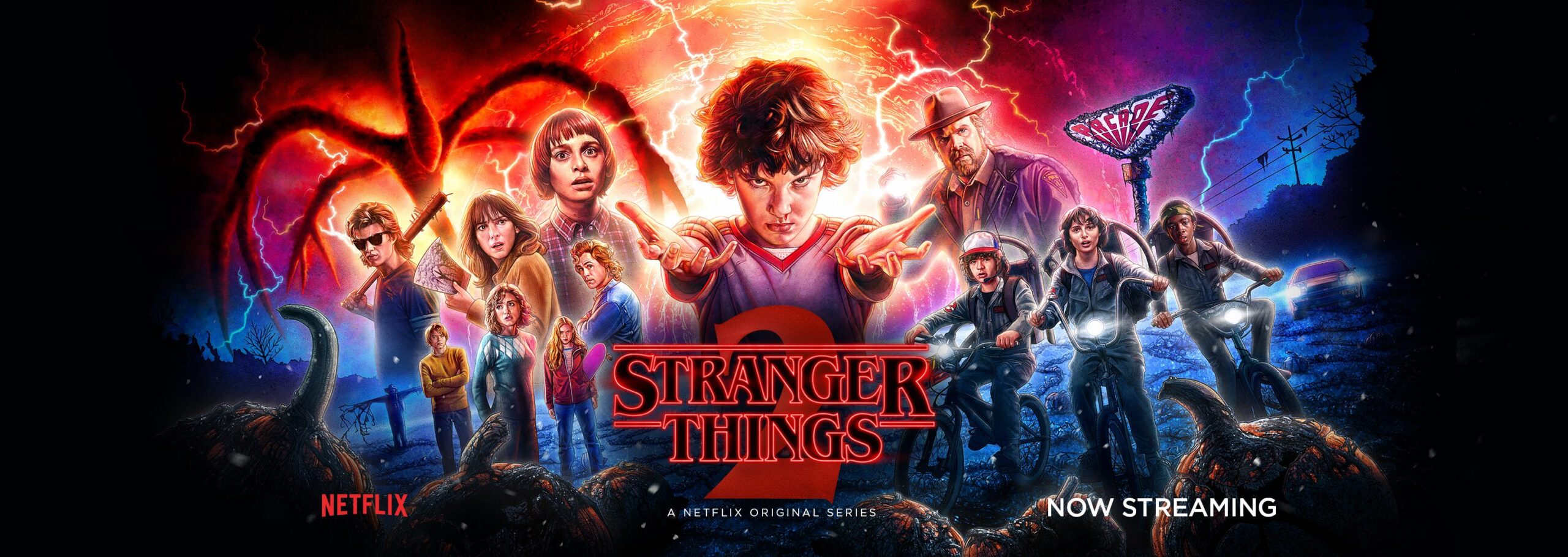
Photo Credit: Netflix
Neon Nostalgia and ‘80s Visual Culture
Stranger Things does not reference the 1980s. It inhabits it.
Every visual choice pulls from a shared cultural memory. Synth soundscapes. Walkie-talkies. BMX bikes cutting through empty streets. Denim that feels worn, not styled. The aesthetic never feels ironic. It feels lived in.
Visually, the influences are clear and confident. Spielberg’s sense of wonder. Carpenter’s restraint and dread. Cronenberg’s discomfort. Even the main titles reflect this lineage. Hollow Benguiat letterforms emerge slowly from darkness, paired with a pulsing synth score that feels closer to Blade Runner than modern television. Type, sound, and pacing work together to transport the viewer instantly.
World-building extends beyond the screen. The alphabet wall. Scoops Ahoy’s hand-drawn logo. Starcourt Mall’s neon signage. Dungeons and Dragons rulebook graphics. Each element feels like a found artifact from 1985.
Even the show’s collaborations respected this logic. Eggo packaging. Vintage Coke cans. Arcade cabinets. Apparel. None of it felt bolted on. It all looked like it belonged in Hawkins.
That is the difference between nostalgia as decoration and nostalgia as design language.
The Cultural Impact
Stranger Things reshaped how nostalgia is used in modern branding. It proved that retro design does not need exaggeration to be effective. It needs commitment.
The show’s typography, palette, and pacing have influenced everything from entertainment branding to startup logos chasing a sense of analogue credibility. Designers like us took note. Fewer elements. Stronger type. Slower motion. Clear mood.
For brands, the lesson was bigger. Nostalgia works best when it is integrated, not advertised. Product placements became extensions of the story. Collaborations felt earned because they aligned visually and emotionally with the show’s world.
Stranger Things also reminded industries that consistency builds trust. A single logo system. A restrained palette. A recognisable motion language. Repeated over time, these choices compound into cultural memory.
That is not trend-driven design. That is identity.
Photo Credit: Wikipedia.
Closing the Loop: A Design Reflection
Across its entire run, the series maintained a rare level of design discipline. The same logo. The same typographic backbone. The same tension between red and blue. Applied patiently across seasons, formats, and mediums. Nothing felt retrofitted or reactive. The identity was embedded from the start.
From Zaapr’s perspective, this is the real takeaway. Great design is not about constant reinvention. It is about clarity, restraint, and evolution within a system. Stranger Things demonstrated how design can carry emotional weight. Posters foreshadowed the story. Color signaled danger before dialogue did. Typography alone established genre and mood.
The show did not borrow the past for surface-level nostalgia. It built an entire world from it.
That is why the final visuals felt less like an ending and more like coming full circle. If a TV series can build this level of emotional equity through design, imagine what a brand can do with the same clarity and intent. At Zaapr, this is the kind of long-term thinking we bring to every identity we build.