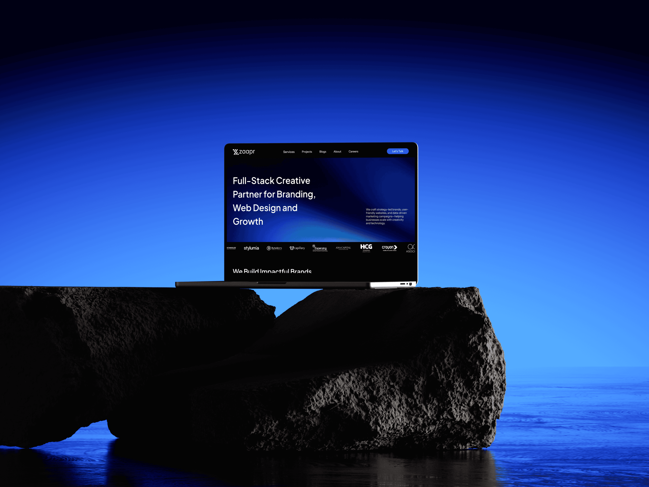
Every agency reaches this point at some stage.
You spend your time building brands and websites for your clients, while your own website keeps running quietly in the background. It still works. It still explains what you do. But every once in a while, a moment comes along that sparks a change.
That’s where we found ourselves toward the end of last year. We realized our website had become a reflection of where we were, not where we’re headed. So we did what we advise our clients to do — pause, reassess, and redesign with intent.
This blog dives deeper into our website revamp.
Why We Decided to Revamp
It’s a familiar story, and one we often hear from most of our clients. Our previous website served us well for years. It explained what we do, but not how we think or why we’re different. But over time, Zaapr evolved, the gap between our work and our website kept growing, and it became hard to ignore.
Over the last year, Zaapr has become far more intentional in how we approach branding, websites, and marketing. Our thinking became clearer. Our projects became more strategic. Clients started coming to us not just for design execution, but for structure, clarity, and long-term outcomes. The website, however, didn’t reflect any of that. It felt fragmented. It didn’t explain how we think, how we work, or reflect the experience clients actually have when working with us.
This website redesign wasn’t about trends or a visual refresh for the new year. It was about alignment. We needed a website that felt honest to where Zaapr is today — one that represents our thinking, our process, and the kinds of work we want to do more of going forward. Something that could grow with us, instead of quietly holding us back.
Old vs. New Website: What Fundamentally Changed
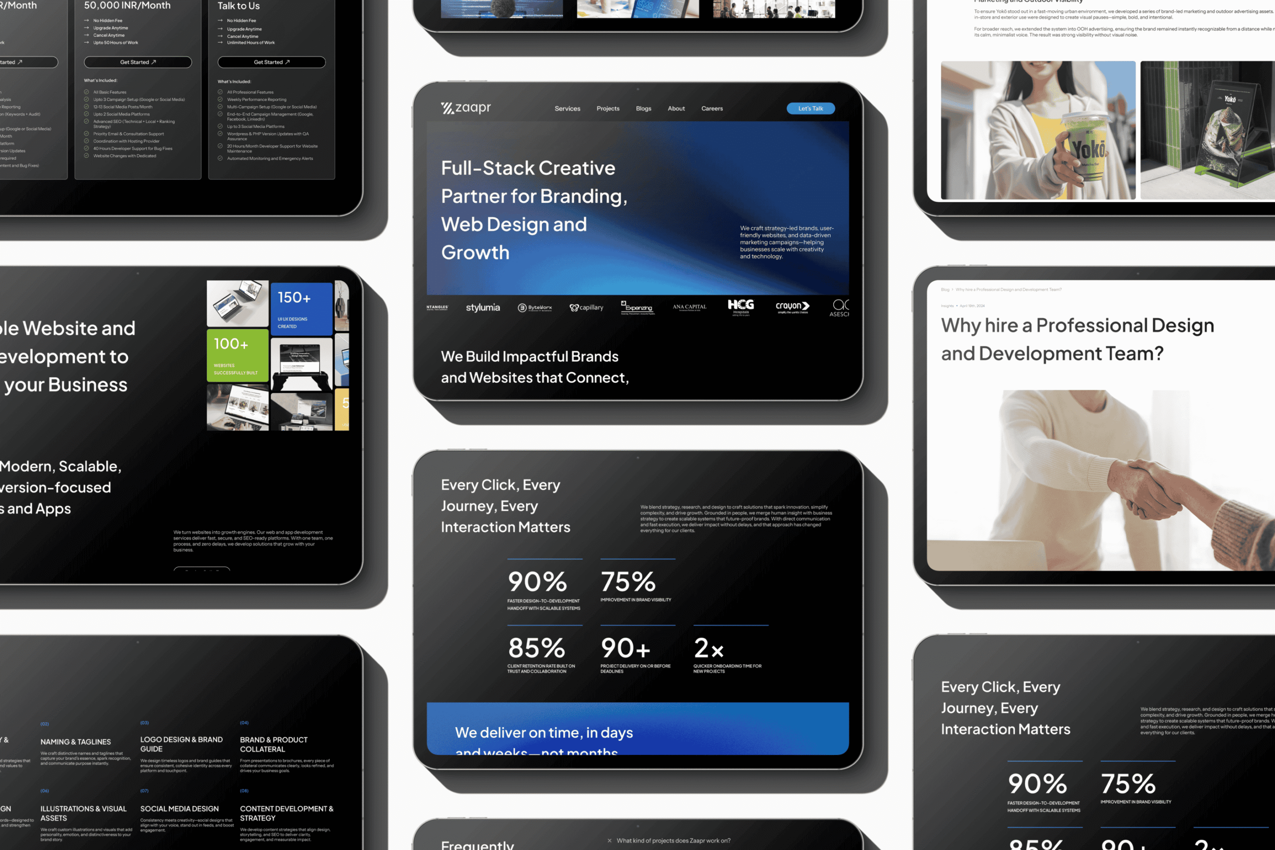
Once we were clear on why the website needed to change, the direction became obvious. The shift wasn’t driven by visuals first, but by structure and intent. The previous site tried to cover everything at once. The new site is built around saying the right things, in the right order.
We moved away from broad explanations and surface-level claims and focused instead on clarity. Messaging is more deliberate. Sections are places to reflect on how people actually read and decide. Whitespace, hierarchy, and layout are used to create emphasis, not decoration. The result is a more modern, minimal experience that feels considered rather than crowded.
Every page is now designed to lead with thinking, not noise. Instead of over-explaining, the site gives space to the work, the process, and the outcomes. This shift in approach shaped every decision that followed, from design and content to UX and development.
The Design: Clarity, Contrast, and Restraint
With the structure and messaging defined, the visual design became an exercise in restraint. The goal wasn’t to decorate the interface, but to create a design system that reinforces clarity, hierarchy, and focus across every page.
The color system is intentionally limited. Deep, confident base tones establish contrast and visual depth, while accent colors are used sparingly to guide attention and reinforce key actions. Dark surfaces paired with controlled highlights improve content legibility, reduce visual noise, and give the interface a more mature, contemporary feel. Color here functions as a navigational and hierarchical tool, not an aesthetic layer.
Typography does much of the heavy lifting. The type system is designed around readability, scale, and rhythm. Clear typographic hierarchy helps users understand importance at a glance, while consistent spacing and line lengths make longer content easier to consume. Headlines are assertive without being dominant. Body text is optimized for comfort, not density. Together, they create a natural reading flow that encourages engagement rather than skimming.
Across the site, layout and whitespace are used deliberately to create separation, emphasis, and breathing room. Nothing is ornamental. Every visual choice exists to support structure, reduce cognitive load, and keep attention on what matters. This approach to visual design sets the foundation for an experience that moves with intention, not friction.
UI/UX: Designed to Move without Friction
From a user experience perspective, the site is built to feel effortless.
Navigation is minimal and predictable. Pages unfold logically. Content is structured so visitors intuitively understand where they are, what Zaapr does, and what to explore next — without being pushed or overwhelmed.
Micro-interactions and transitions are subtle, not distracting. They add a sense of polish and responsiveness without slowing the experience down. The site feels fast because it is fast — but also because nothing unnecessary gets in the way.
The goal wasn’t to impress users with complexity, but to create a flow that feels natural and confident. The kind that makes people stay longer without realizing why.
Development and Performance: Invisible, but Critical
Performance was treated as part of the design system, not a technical afterthought. From the beginning, the site was built with speed, stability, and consistency in mind, because user experience is shaped as much by behavior as it is by layout.
The new website is built with a fully responsive system across mobile and desktop, ensuring performance, accessibility, and consistency aren’t compromised at any screen size. Layouts, components, and interactions are designed to adapt intentionally, not collapse by default, so the experience remains clear and usable regardless of device or context.
From a build perspective, we chose WordPress with Elementor Pro to balance flexibility with control. This allowed us to design modular layouts, maintain visual consistency, and optimize content delivery without overengineering the stack. The focus stayed on clean structure, predictable behavior, and long-term maintainability, all of which support performance, accessibility, and search visibility.
By keeping the development layer lean and performance-led, the site remains fast, reliable, easy to evolve, and lets the content take focus.
Content and Messaging: Saying less, meaning more
With the structure, design, and performance foundations in place, attention shifted to content. The goal wasn’t to say more, but to say the right things with clarity and purpose.
We approached messaging as a system, not a collection of statements. Generic agency language was stripped away and replaced with copy grounded in intent, positioning, and real workflows. Instead of describing ourselves the way agencies are expected to sound, we focused on how we actually work, what problems we solve, and the outcomes we help clients achieve.
Service content was reframed around value and context rather than exhaustive lists. Clear hierarchy and tighter copy reduced the need for over-explanation, allowing layout, spacing, and visual structure to carry meaning. This makes pages easier to scan, improves comprehension, and supports both user experience and search visibility.
The result is content that feels confident and direct. It prioritizes clarity over persuasion, substance over performance. A messaging approach designed to support trust, not sell it.
The Results So Far
It’s still early days, but the early signals are strong and encouraging.
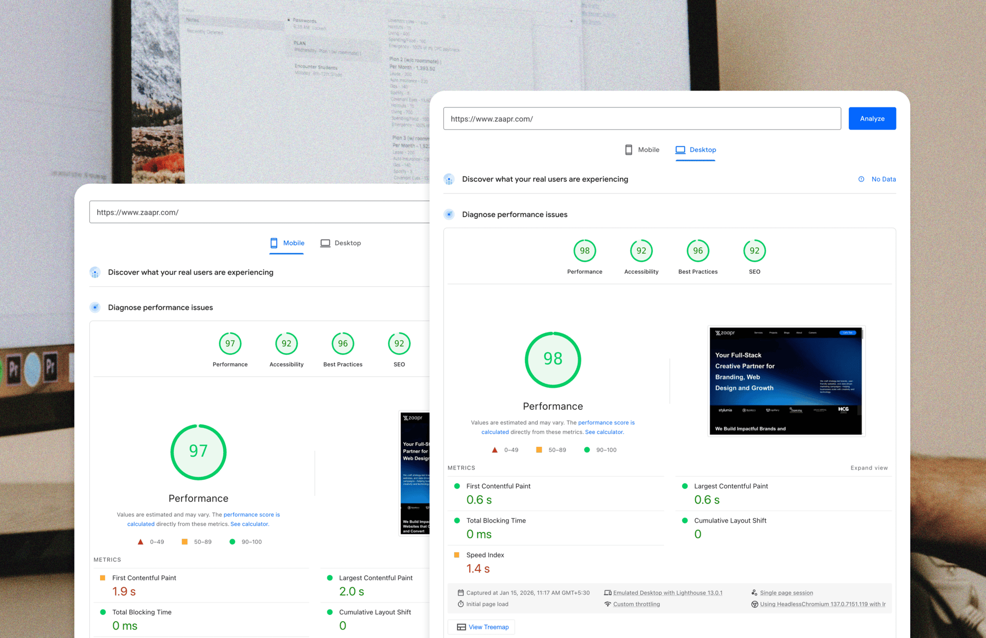
- Both Desktop and Mobile performance score overall is above 90% for best practices, accessibility, and SEO, reflecting consistent performance across devices and contexts.
- Fast load times and stable layouts, supporting smooth interactions and a reliable user experience.
- Longer engagement, with visitors spending more time exploring content and viewing more pages per session.
- Clearer navigation patterns, with users moving through the site with clearer intent rather than bouncing between pages.
- Improved search visibility across key terms, reflecting clearer structure, focused content, and a performance-led foundation.
So far, the website is doing its job. It’s supporting the business, strengthening first impressions, and creating alignment before a single conversation begins.
And like any good digital system, it’s not finished. We’ll continue to monitor, refine, and iterate as Zaapr evolves. Because this redesign wasn’t just about a new look. It’s a reflection of where Zaapr is today, and a foundation for where we’re headed next.
If you haven’t explored the new site yet, take a look. And if you’re thinking about doing the same for your brand, we’d love to talk.

