
Let’s be real—making a website behave beautifully across every screen size can feel like an endless debug loop. You’re juggling media queries, trying to strike the perfect balance between fluidity and control, and somehow still ending up with too much CSS.
This is exactly where CSS “clamp()” steps in and changes the game—giving you precise control and fluid responsiveness in a single, elegant line of code.
Responsive design has always been a key part of building modern web experiences. But as screens get larger, devices get smaller, and layouts become more dynamic, older techniques start showing their cracks. By combining flexibility, readability, and precision, “clamp()” function simplified responsive typography, margins, padding, and more, offering a cleaner alternative for many of those pain points.
At Zaapr, we’re big believers in creating smarter systems, not bigger stylesheets—and “clamp()” fits perfectly into that philosophy.
What is “clamp()”?
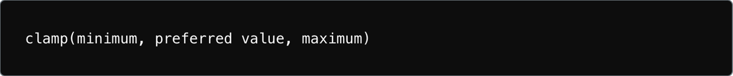
The CSS “clamp()” function allows you to define a value that adjusts dynamically. Think of clamp () as setting a minimum, a preferred (fluid) value, and a maximum for any CSS property.
It’s like telling CSS:
“Scale this smoothly…but don’t go below this size, and don’t exceed that size.”
For example,
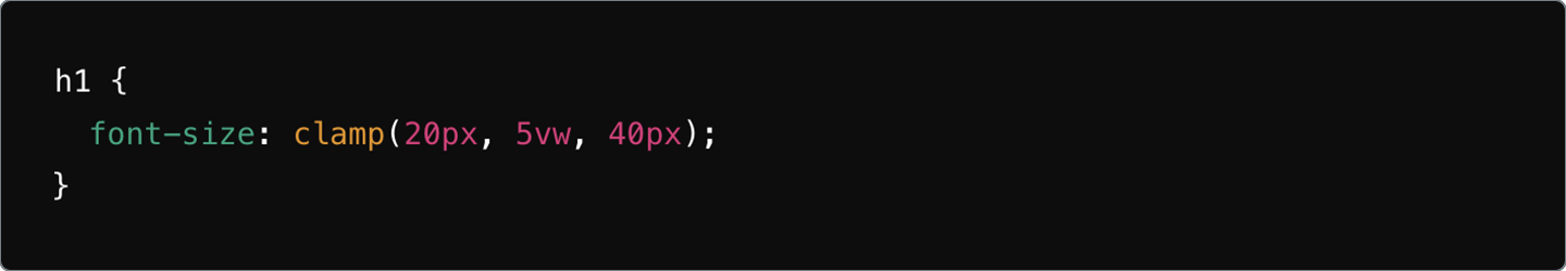
Here’s what each parameter means:
- Minimum: The font size will never shrink below 20px.
- Preferred: It scales fluidly using 5VW (5%) of the viewpoint width.
- Maximum: The font size will never grow beyond 40px.
It’s responsive design with guardrails—smart, intentional, and beautifully controlled.
Why do Designers and Developers love “clamp()”?
It’s not about saving time. Designers and developers use clamp() because it gives them control and creativity.
1. Cleaner CSS—No more Media Query Overload
Traditionally responsive values need multiple breakpoints:
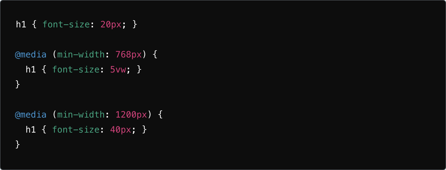
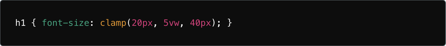
While effective, they often clutter CSS files. With clamp(), you replace all of that with one line. It’s clean. It’s readable. It’s far easier to maintain.
2. Fluid Design without Losing Control
Viewport units alone (like vw) can get unpredictable:
- Too tiny on small screens
- Too massive on ultra-wide monitors
clamp() gives you fluidity and fixed limits—the best of both worlds.
3. More Time to Create, Less Time to Hack CSS
Because clamp() reduces repetitive styling, you spend less time writing media queries and more time actually designing. It’s all about working smarter, not harder—something every creative team appreciates.
Why do most Top Brands use clamp()?
Brands care about two things: consistency and experience.
1. Better Use Experience
clamp() ensures typography, spacing, and interactive elements stay balanced across devices—resulting in smoother UI, stronger storytelling, and higher engagement.
2. Faster, Scalable Development
Fewer breakpoints =
- Easier debugging
- Cleaner CSS
- Faster load times
- Better performance
Brands that iterate quickly absolutely love this.
3. A More Modern, Sleek Aesthetic
clamp() enables that sleek, fluid feel you see in brands like Apple, Airbnb, and Shopify—responsive design that feels intentional, not forced.
How clamp() Elevates Different Parts of your Design?
Below are real-world examples of how clamp() can transform your UI.
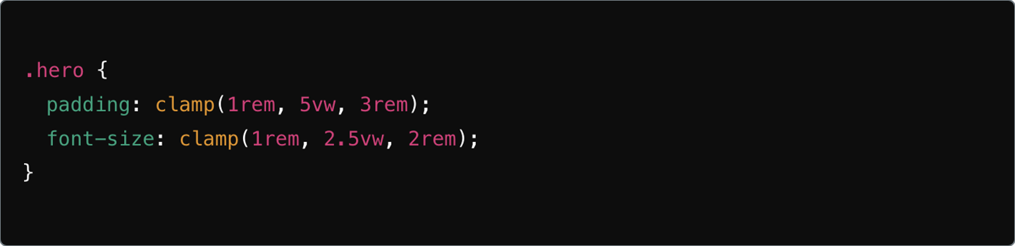
1. Fluid Typography that Always Looks Right
For a SaaS website like Techify, you may want headers to adapt smoothly while keeping them readable.
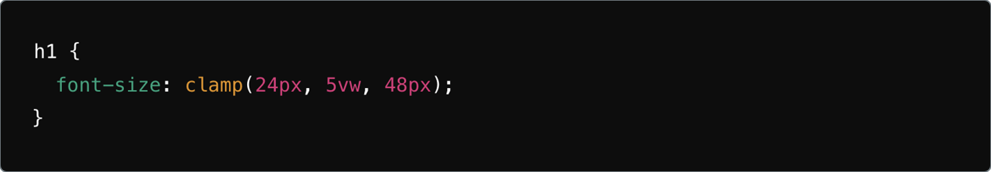
This ensures text feels balanced on every device—no tiny mobile text, no giant desktop headers.
2. Flexible Margins and Padding
For an e-commerce brand like ShopEase, spacing is everything.
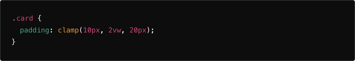
This ensures clean spacing, consistent layouts and no fragile breakpoints.
3. Responsive Margins on Blog Page
Blogs like Medium rely heavily on readable content flow.
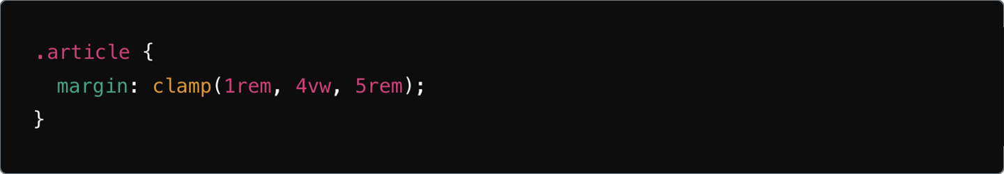
Perfect for maintaining comfortable spacing from mobile to desktop.
4. Button Widths that Adapt to Users
For a travel site like MakeMyTrip, buttons must adapt well to different devices.
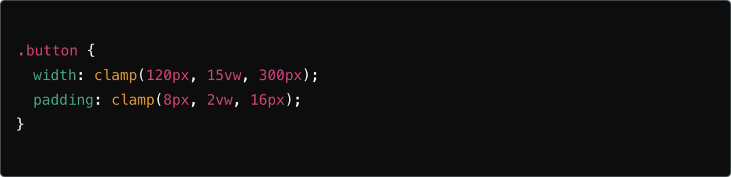
Fluid adaptability = better interaction + better conversions.
5. Flexible Grids for Premium Editorial Layouts
Companies like Architectural Digest, rely on precise visual hierarchy.
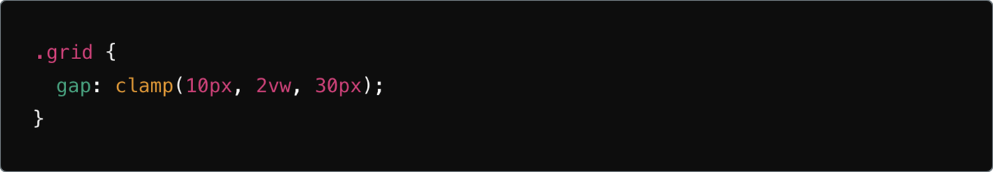
This creates a grid that adapts without needing custom breakpoints for every screen size.
6. Clamping Multiple UI Elements for Balance
For beauty brands like GlowCosmetics, hero text and visuals must stay in sync.
Perfect symmetry, no matter the device.
Zaapr’s Pro Tips for Mastering clamp()
Whether you’re just getting started or looking to refine your responsive strategy, here are our tried-and-tested principles:
1. Experiment with Units
Combine px + vw + em to match the personality of each component for perfect scaling.
2. Understand your Breakpoints
Base your minimum and maximum values on real design needs, not arbitrary guesses.
3. Use calc() When Needed
For complex layouts, pair clamp() with calc() for advanced precision.
4. Start Small and Scale Up
Begin with one element like fonts, then expand to spacing, grids, and components.
5. Test Across Devices
Always test how your clamp() values behave on different screen sizes to ensure a smooth experience.
6. Use DevTools Live
Modern browsers let you tweak clamp() in real time—use it to fine-tune your scaling.
The Future of Responsive Design is Here and It Starts with clamp()
CSS clamp() is one of the most powerful functions designers and developers have today. It bridges the gap between fluid responsiveness and controlled aesthetics, giving you:
- Flexible layouts
- Predictable behavior
- Clean code
- And a better user experience
At Zaapr, we don’t just design websites, we engineer intelligent, scalable digital experiences that make brands look sharp across every device. If you’re ready to implement advanced CSS strategies like clamp() or revamp your entire design system, we’re here to help.
Explore how we build future-ready digital products.